Spatial Omics I: Transcriptional Signals Over Tissue Domains
An introduction to graph signal processing in spatial omics data
Introduction
Cells are arguably the fundamental unit of biology. They have different roles in the tissue that can largely be ascribed to their molecular contents. Such “cell types” are often catalogued by efforts such as the Human Cell Atlas which serve as valuable references for identifying disease-associated cell types. But cells don’t act independently. If you look at an organism, you’ll notice a few things. First, it’s an organism; there’s some sense that it’s a discrete collection of cells all working together. Second, you might notice that cells within a given organism are further organized into discrete multicellular structures, such as organs or the anatomical regions within them. Third, and perhaps most importantly, the very formation and function of such structures is driven by interactions between their constituent cells. Altogether, it is critical to look beyond isolated cells to recognize how they collectively govern tissue structure and function.
We can break these patterns down into two broad categories.
- Multicellular regions are what we’ll call molecularly-distinct collections of adjacent cells in physical space. We expect to observe these repeatedly within the same or across different tissues.
- Intercellular interactions are what we’ll call the communication patterns between neighboring cells that likely define or even give rise to these regions.
Both of these patterns are inherently spatial. However, it’s not clear what length scale they occur on: are we talking about pairs of cells or entire tissues? In this series of posts, we will leverage graph signal processing (GSP) in single-cell resolved spatial transcriptomics data to isolate and investigate patterns on specific length scales. This will allow us to rigorously define regions and interactions in future posts. We’ll first demonstrate the fundamental concepts in a simple simulation. This will allow us to build up some intuition before approaching data gathered from real tissues, which are full of both technical artifacts and true biological complexity. It’ll also come in handy for future blog posts covering more complex ideas. The work in this series of posts is based on this manuscript.
Simulation
To construct a simulated tissue, we’ll take inspiration from the mammalian brain, which has a simple layered structure with clearly defined molecular markers for each layer region. This will inform how we decide where the cells are (i.e. the domain) and what gene expression patterns they display (i.e. the signals).
The tissue domain
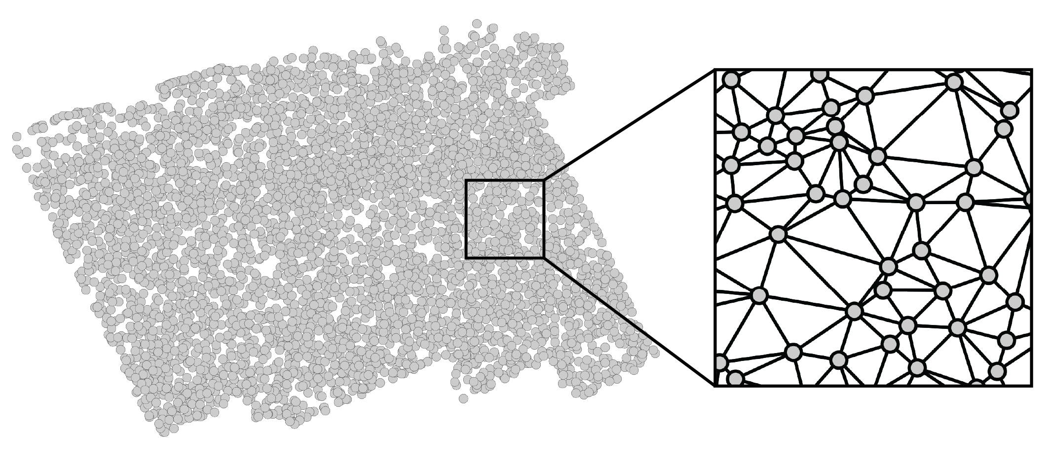
We’ll start off by creating a simple tissue made up of $n=2000$ cells randomly scattered throughout a unit circle. Such a Poisson point process may not be a perfectly accurate reflection of the more structured physical distribution of cells in tissues, but it is capable of yielding valuable insight nonetheless. Furthermore, while tissues are inherently three-dimensional and might be more accurately simulated within a sphere, experimental technologies typically measure them in two-dimensional slices. Thus, we will rely on two-dimensional simulations. That being said, everything presented in this series of posts can be generalized to distributions of cells in three-dimensional space.
Mathematically, we can think of the tissue domain as an undirected graph over $n$ nodes, each of which represents a cell. We could construct this graph in many ways, including connecting each cell to its $k$ nearest physical neighbors. However, I personally prefer using a Delaunay triangulation, as it creates a mesh that’s embeddable in 2D, which respects my own visual intuition. If you’re optimistic, you might also believe that it captures the mechanical forces present in biological tissues. After performing a Delaunay triangulation, we can zoom in to see that the cells are indeed connected to their spatial neighbors to form a 2D mesh. These connections define how we can hop from cell to cell. Altogether, this graph constitutes a domain: a set of positions and the movements we can make between them.
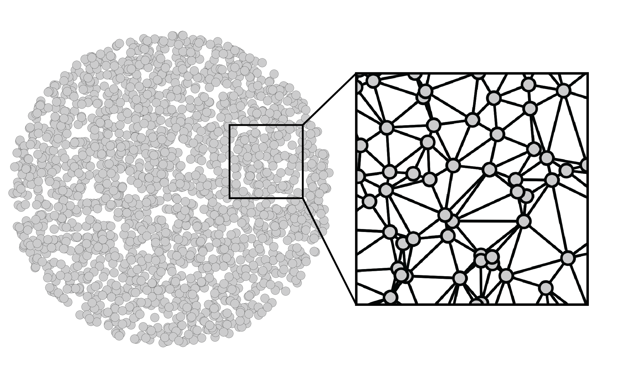
More explicitly, our graph can be represented by the symmetric adjacency matrix
\[\mathbf{A} \in \{0,1\}^{n \times n}.\]Each entry \(\mathbf{A}_{ij}\) is either $1$, which represents two cells that are spatially adjacent, or $0$, which represents two cells that are not adjacent. While we could weight these edges based on physical distances between cells, we will instead stick to simple binary edges for simplicity. We also will not consider self loops: \(\mathbf{A}_{ii} = 0\). The number of neighbors for cell $i$ – the “degree” – is given by \(d_i = \sum_j \mathbf{A}_{ij}\). These values are often consolidated into the diagonal degree matrix $\mathbf{D} = \operatorname{diag}(d_1, …, d_n)$. Finally, we can introduce the Laplacian matrix
\[\mathbf{L} = \mathbf{D} - \mathbf{A}\]We can think of the Laplacian as a slight modification of the adjacency matrix that’s more closely related to the notion of frequency, as we will see below. For convenience, we will instead consider the edge-normalized Laplacian $\mathbf{L} = \mathbf{I} - \mathbf{D}^{-\frac{1}{2}} \mathbf{A} \mathbf{D}^{-\frac{1}{2}}$, since it’s eigenvalues have some nice properties that we will leverage later.
Note that the order of cells in these matrices is arbitrary. It doesn’t matter so long as it is consistent across all related vectors and matrices.
Transcriptional signals
Now that we have a simulated tissue domain, we can create gene expression (i.e. transcriptional) signals over it. A signal is a vector of values associated with each node in our graph. In our case, we are interested in the amount that a given gene is expressed within each cell of a tissue. We can collect all of these values into a list, yielding the vector $\mathbf{x} \in \mathbb{R}^n$, where $\mathbf{x}_i$ is the amount of gene $x$ expressed in cell $i$. We can collect all of these gene signals into the matrix
\[\mathbf{X} = [\mathbf{x}_1 | ... | \mathbf{x}_g] \in \mathbb{R}^{n \times g},\]where $g$ is the number of genes measured. This is the “cell-by-gene matrix”, the fundamental data structure underlying all of single-cell omics.
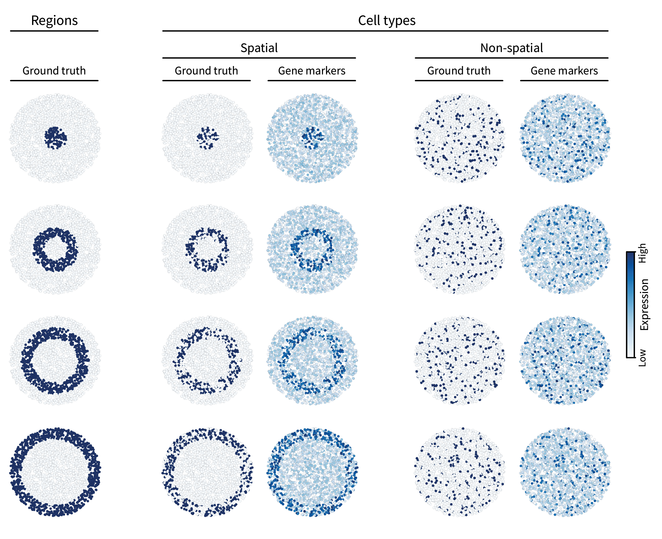
Let’s add some signals to our simulation. The first type of spatial pattern we are interested in is multicellular regions. In the neocortex, gene expression patterns define distinct layers. To simulate such patterns, we can first assign ground truth region labels to all cells in our tissue. We’ll do so by splitting the tissue into four layers radially, creating a bullseye pattern. However, in the brain, these layer-specific genes are mainly expressed by only a subset of cells – specifically neurons. To reflect this, we will take a subset of the cells within each ground truth region and assign them a ground truth “spatial” cell type identity. The rest of the cells will be grouped together and randomly assigned a “non-spatial” type, reminiscent of glial (i.e. non-neuronal) cells. Finally, each type is assigned multiple gene markers by adding different instances of uniform noise to its corresponding ground truth pattern (though only one gene marker is shown per type in the figure below).
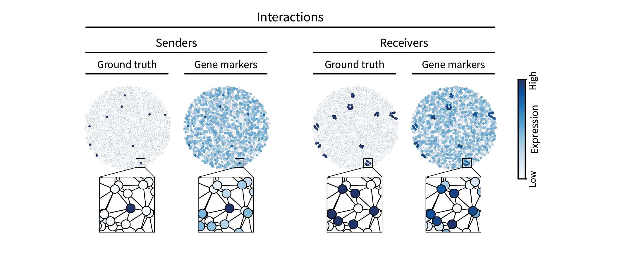
The second type of spatial pattern we are interested in is intercellular interactions. Such interactions can be mediated by many molecular mechanisms, but one simple one that we will simulate here is juxtacrine signaling, in which cells communicate via direct contact. For instance, a juxtacrine interaction may occur between two cells when one cell expresses a ligand, the other cell expresses the corresponding receptor, and the two cells are adjacent to one another. We’ll refer to one of these cells as the “sender” and the other the “receiver”. We can simulate this pattern by randomly assigning a sparse set of cells in the tissue a ground truth sender type and then assigning all of their neighbors a ground truth receiver type. If the ground truth sender signal is given by \(\mathbf{s} \in \{0,1\}^n\), we can spread it to its neighbors by multiplying with the adjacency matrix, yielding the ground truth receiver signal $\mathbf{r} = \mathbf{A} \mathbf{s}$. (For consistency, we can ensure that \(\mathbf{r} \in \{0,1\}^n\) by thresholding to assign unit value to anything nonzero.) Just as above, we can then add uniform noise to create gene markers.
Together, our Laplacian and cell-by-gene matrices $\mathbf{L}$ and $\mathbf{X}$ describe a domain and a set of signals with which we can perform signal processing to identify patterns on specific length scales.
Frequencies
The first step in isolating a given length scale is to ask: how do we define length scales? In the language of signal processing, we define them in terms of frequencies. Take music, for instance, in which the different frequency ranges of bass, mids, and trebles define different time scales along which a sound can vary. Similarly, our notion of length scale can be made quantitatively rigorous in terms of spatial frequencies. While a straightforward extension of this concept to two dimensions captures spatial frequencies in an image, it’s not so straightforward to extend to graphs due to their irregular topology; an image is a uniform grid of points, whereas a graph can have arbitrary connections between them. Thus, we have to do a little leg work to extend this concept to our tissue domain.
We can start with the intuitive definition of frequency in a graph setting. Consider a hypothetical signal $\mathbf{v}$ over the tissue. The notion of frequency is simply “how much does the signal tend to change as I take a step in the domain?” Taking a step in our tissue domain corresponds to moving between neighboring cells $i$ and $j$. The change in our signal as we take this step is thus given by $\mathbf{v}_i - \mathbf{v}_j$. However, we don’t really care about the sign, so we can just square it to get $(\mathbf{v}_i - \mathbf{v}_j)^2$. This is just one step, and we care about how the signal tends to change with steps throughout the whole tissue in general. To capture this tendency, we can simply sum over all pairs of neighboring cells, yielding our final definition of frequency
\begin{equation} \label{eq:freqdef} \lambda = \sum_{ij} \mathbf{A}_{ij} (\mathbf{v}_i - \mathbf{v}_j)^2 \end{equation}
Note that because we are summing over all possible pairs of cells $i$ and $j$, we have to multiply each one by $\mathbf{A}_{ij}$ so that we only consider neighboring pairs.
This definition of frequency for a given signal might make sense, but what we are really looking for is an ideal set of signals that represent all possible frequencies, much as time scales are given by sine waves of all possible frequencies. It turns out that, because our tissue domain is finite and discrete, we can actually solve for a finite set of all possible frequencies, and it ends up being a basis in the linear algebraic sense.
To see this, let’s first rewrite eq. \eqref{eq:freqdef} as a “quadratic form”, which works in our favor by getting us a step further into the realm of linear algebra:
\[\lambda = \mathbf{v}^{\top} \mathbf{L} \mathbf{v}.\]How exactly can we show that?
Eq. \eqref{eq:freqdef} can be converted into a quadratic form via a process reminiscent of annealing. First, we heat it up by factoring the $\mathbf{v}$ terms to get
\[\sum_{i,j}\mathbf{A}_{ij}( v_i v_i + v_j v_j - v_i v_j - v_j v_i ).\]We can then begin to cool it down by combining positive and negative terms, respectively, yielding
\[2 \sum_{i,j}\mathbf{A}_{ij} v_i v_i - 2 \sum_{i,j}\mathbf{A}_{ij} v_i v_j.\]Note that, for a fixed row $i$, the left-hand term corresponds to summing $v_i v_i$ together $d_i$ times, where $d_i$ is the sum of the $i$th row of $\mathbf{A}$. Thus, one could equivalently express the left-hand term as
\[2 \sum_{i}\mathbf{D}_{ii} v_i v_i.\]Now both the left and right terms themselves correspond to quadratic forms, yielding
\[2 \mathbf{v}^{\top} \mathbf{D} \mathbf{v} - 2 \mathbf{v}^{\top} \mathbf{A} \mathbf{v}.\]Further simplifying, we have
\[2 \mathbf{v}^{\top} (\mathbf{D}-\mathbf{A}) \mathbf{v}\]and further
\[2 \mathbf{v}^{\top} \mathbf{L} \mathbf{v}.\]The factor of two arises from double counting each edge, which corresponds to a directed edge in each direction. Because we tend to think of each undirected edge as only a single edge going both ways, folks tend to omit this factor, yielding the final expression
\[\mathbf{v}^{\top} \mathbf{L} \mathbf{v}.\]We can further rearrange this expression into an eigenvalue problem:
\[\lambda \mathbf{v} = \mathbf{L} \mathbf{v}.\]How exactly can we show that?
We should probably normalize $\lambda = \mathbf{v}^{\top} \mathbf{L} \mathbf{v}$ to guarantee that the overall expression strength doesn’t influence the frequency value. After all, we really only care about the relative spatial distribution of the signal, not its overall magnitude. We can do this normalization by dividing the magnitude out:
\[\lambda = \frac{\mathbf{v}^{\top} \mathbf{L} \mathbf{v}}{\mathbf{v}^{\top} \mathbf{v}}.\]Note that this is a Rayleigh quotient, which is intimately tied to eigendecomposition. With a bit of rearranging, we end up with an eigenvalue problem:
\[\begin{align} & \lambda = {\frac{\mathbf{v}^{\top} \mathbf{L} \mathbf{v}}{\mathbf{v}^{\top} \mathbf{v}}} \nonumber \\ &\rightarrow \lambda \mathbf{v}^{\top} \mathbf{v} = \mathbf{v}^{\top} \mathbf{L} \mathbf{v} \nonumber \\ &\rightarrow \lambda \mathbf{v} = \mathbf{L} \mathbf{v}. \nonumber \end{align}\]This is a critical insight because $\mathbf{L}$ is symmetric positive semidefinite (PSD) and thus has an eigenbasis of eigenvectors with real, nonnegative eigenvalues. This eigenbasis is given by the matrix
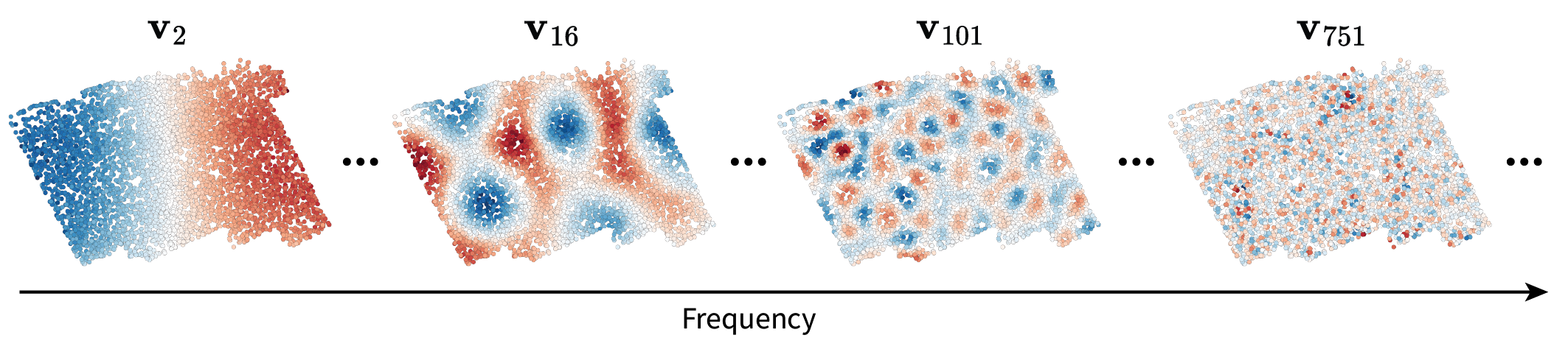
\[\mathbf{V} = [\mathbf{v}_1 |...| \mathbf{v}_n] \in \mathbb{R}^{n \times n}.\]Let’s plug all of this terminology into our context of interest by realizing two key points. First of all, we found that there exists a finite set of ideal signals ${\mathbf{v}_1, …, \mathbf{v}_n}$ that represent “all possible frequencies” – and thus all possible length scales – over our tissue domain. This is great because it means we can rigorously talk about any length scale of interest. Below are some examples plotted in the tissue to illustrate this intuition. Note that no gene expression information went into calculating these frequencies; rather, they are an abstract representation of variation on different length scales.

Why do highs appear constrained to one part of the tissue?
When taking a look at $\mathbf{v}_{301}$, the fluctuations appear constrained a bit toward the lower left of the tissue. I’ll just provide some intuition for this observation.
This asymmetry (or “localization”) is due to the irregularity of the graph domain. Consider the time and image domains in which you always have the same choice of how to move no matter where you are in the tissue (apart from the boundaries). Graphs generally lack this regularity due to the variation in degree across different nodes. At one node, you may have four options of where to move next. At the next node, you may have seven options.
Consequences of this irregularity arise when considering the maximum frequency patterns over the graph, which we can think of as
\[\mathbf{v}_{max} = \operatorname{argmax}_{\mathbf{v}} \frac{\mathbf{v}^{\top} \mathbf{L} \mathbf{v}}{\mathbf{v}^{\top} \mathbf{v}}\]Because of its normalization, \(\mathbf{v}_{max}\) should ideally be concentrated on a single node and its immediate neighbors. Furthermore, it should specifically be concentrated on the node with the most neighbors, i.e. the highest degree. Indeed, when visualizing $\mathbf{v}_{1994}$, we can see that it’s concentrated on nodes with relatively high degrees (compared to the degree of six we’d expect here).

Interestingly, this phenomenon has deep connections to the Heisenberg uncertainty principle.
The second key point is that this set of ideal frequencies forms a basis in the linear algebraic sense. This means that when we do measure a gene expression signal, we can project it into this “frequency space” to quantify its prevalence on each length scale.
That’s what we’ll do next.
Spectra
We can think of projecting a given gene expression signal $\mathbf{x}$ into frequency space as comparing it to each frequency $\mathbf{v}_i$. For a single frequency, this is given by the inner product $\mathbf{v}_i^{\top} \mathbf{x} \in \mathbb{R}$. For all frequencies, this is given by the matrix product $\mathbf{V}^{\top} \mathbf{x} \in \mathbb{R}^n$, where the output is the similarity of $\mathbf{x}$ to each of $\mathbf{v}_1, …, \mathbf{v}_n$. This vector is often referred to as the signal’s “spectrum”. An analogy I tend to think of is that the original gene expression signal over the tissue is like a dish you might cook. You could always think of that dish in terms of its corresponding recipe, i.e. the amounts of each ingredient necessary to construct it. In this case, the recipe is the spectrum, and the ingredients are the frequencies. This process of representing a signal in terms of its spectrum is known as the Fourier transform.
Let’s visualize one of our region marker genes’ spectra as an example.
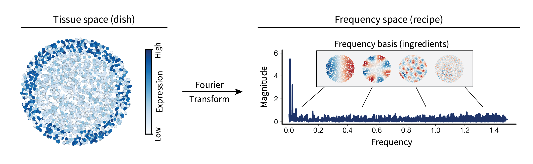
By design, this gene forms a large-scale pattern over the tissue. As a result, its spectrum shows a spike in the low frequencies. Thus, we now have a way of calculating the frequency contents (or length scale contents) of a given gene expression signal within a tissue.
Note that, while the spectrum shown above is entirely positive, spectra generally do contain negative values. We just chose to take the absolute value of the spectrum to better convey the intuition of how prevalent a signal is over a given length scale, i.e. omitting its sign. Additionally, we chose not to visualize the first value, as it just corresponds a translation factor.
Why is the first value just a translation factor?
What I mean by a “translation factor” here is just an “intercept” or “bias” term that is added to all cells to shift their expression values up/down by the same amount. Thus, we can think of it as some vector with entries that are all the same value, i.e. a scaled version of the ones vector $\mathbf{1} = [1, …, 1]^{\top}$. We are assuming that it corresponds to the first eigenvalue of $\mathbf{L}$, so let’s first confirm that it’s an eigenvector by multiplying them. Notice that
\[\mathbf{L} \mathbf{1} = 0.\]This follows from how we’ve constructed the Laplacian; the degree of each node is on the diagonal and the instances of each neighbor on the off diagonal sum up to an amount of equal but opposite sign. Thus, the sum over each row, as calculated above by multiplying with the ones vector, is simply $0$. We can write this out in the form of an eigenvalue problem:
\[\mathbf{L} \mathbf{1} = \lambda \mathbf{1} = 0.\]This holds true for $\lambda = 0$, which is the minimal eigenvalue (i.e. “first” when sorted) since $\mathbf{L}$ is PSD. So the first eigenvalue corresponds to the all ones vector, i.e. the uniform shift in all the values over the graph that we wanted to get rid of.
Note that this generalizes to any vector with all equal entries because we could just express it as the ones vector scaled by some scalar $p$, which yields the same result:
\[p \mathbf{L} \mathbf{1} = p \lambda \mathbf{1} = 0.\]There are many interesting things we could do with spectra. You might think of comparing gene expression signals based on their spectra, perhaps to find classes of spectral patterns (i.e. biologically-relevant length scales) using PCA or NMF. However, there are also many interesting issues with these ideas. For instance, a spectrum has the same dimension as its corresponding tissue. This makes comparison across different tissues difficult because the dimensions of spectra likely differ. We’ll leave these pitfalls and opportunities to a future blog post.
For now, let’s instead focus on modifying these spectra, i.e. performing filtering.
Filtering
In the language of the above analogy, modifying spectra allows us to ask “what happens to the dish when I remove this ingredient?” More explicitly, it allows us to modify the frequency contents of a given signal and see how it looks in the tissue. We can think of this process as two steps.
The first step is to modify the signal’s spectrum. We could do this in a crude way by setting entries of the spectrum to zero to get rid of them entirely. However, more generally, we could weight them. For instance, we could define some function – or “kernel” – over frequency values that preferentially weights lows stronger than highs. This is known as a “low-pass” kernel. One popular example of such a function is the diffusion kernel $f(\lambda) = e^{-\tau \lambda}$, where $\tau$ is some parameter that adjusts how “quick” diffusion occurs. This kernel is indeed low-pass, as it is a monotonically decreasing function of frequency. (The intuition of diffusion will likely become clearer once we see the result of this modification in the tissue.) By pointwise multiplying this kernel with the gene expression spectrum from earlier, we end up with a modified spectrum where the lows are maintained and the highs are diminished.
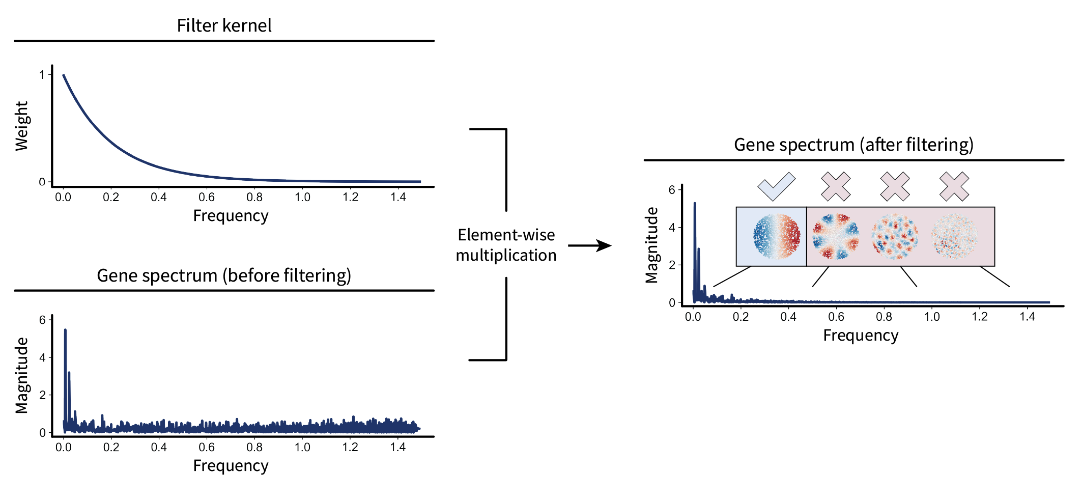
Now let’s represent this mathematically. Pointwise multiplication of two vectors can be represented by turning one of them into a diagonal matrix and then multiplying. Let’s do this with the kernel. We can first arrange all of the frequency values into a diagonal matrix $\mathbf{\Lambda}$. Applying the kernel function to each of the values is the same as applying it to the whole matrix, i.e. $f(\mathbf{\Lambda})$. Multiplication of this diagonal kernel matrix with the spectrum is then given by $f(\mathbf{\Lambda}) \mathbf{V}^{\top} \mathbf{x} \in \mathbb{R}^n$. Altogether, this equation describes modification of the gene’s spectrum. While it might look a little ugly in its current form, it’s nice to keep it this way for later; it’ll allow us to see a neat simplification in a moment.
The second step is to project the modified spectrum back into the tissue to visualize the result. We can do this by multiplying by the inverse of the frequency basis, i.e. $(\mathbf{V}^{\top})^{-1}$. However, because $\mathbf{V}$ is an orthogonal matrix, its inverse is just its transpose: $(\mathbf{V}^{\top})^{-1} = \mathbf{V}$. Thus, we have the full filtering equation
\begin{equation} \label{eq:filterdef} \mathbf{\bar x} = \mathbf{V} f(\mathbf{\Lambda}) \mathbf{V}^{\top} \mathbf{x}, \end{equation}
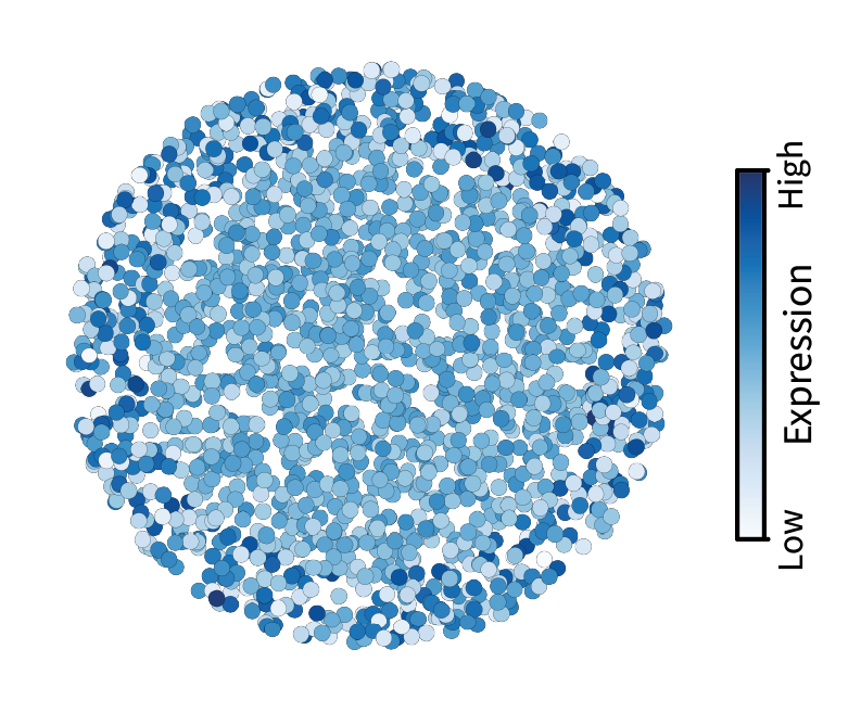
where $\mathbf{\bar x}$ is the filtered version of $\mathbf{x}$. I like to use the bar notation for the smoothed signal because the bar itself is smooth. We can visualize the result of this process below. Use the slider to visualize the signal before filtering (left) and after filtering (right).
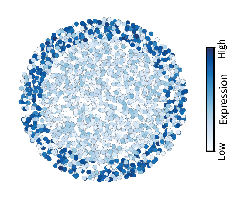

This filter appears to have blurred the underlying gene expression signal. That’s exactly what we expect given that blurring corresponds to getting rid of small-scale fluctuations. Some might think of this as denoising, which makes sense in the context of images. However, in a later post I’ll argue that high frequencies are not noise in the context of tissues.
Using a final bit of math, let’s finish interpreting our filtering function, which is currently a bit lengthy. If you stare at eq. \eqref{eq:filterdef} long enough, you might notice that it looks a lot like the diagonalized form of the Laplacian
\[\mathbf{L} = \mathbf{V} \mathbf{\Lambda} \mathbf{V}^{\top},\]where $\mathbf{\Lambda}$ is the diagonal matrix of eigenvalues and $\mathbf{V}$ is the matrix of corresponding eigenvectors. The only difference is that we applied a function to each of the eigenvalues, i.e. $f(\mathbf{\Lambda})$. Interestingly, for any (analytic) function $h(\lambda)$, we have
\[\mathbf{V} h(\mathbf{\Lambda}) \mathbf{V}^{\top} = h(\mathbf{V} \mathbf{\Lambda} \mathbf{V}^{\top}) = h(\mathbf{L}).\]Why “analytic” functions?
Functions of matrices are often defined in terms of series, e.g. the exponential function. A function that can be described in this way is referred to as “analytic”. Thus, for our kernel function to apply to matrix arguments, it must be analytic.
Thus, any (analytic) filter can be expressed as a function of the Laplacian. This is cool for a few reasons. First of all, it’s pretty. Second, it will actually help us interpret equations that emerge en route to deriving interactions in a future post. Third, it gives us a concise notation to work with for the remainder of this post; given a kernel such as the one above, $f$, filtering can be expressed simply as
\[\mathbf{\bar x} = f(\mathbf{L}) \mathbf{x}.\]While the above filtering example was low-pass, we could instead perform high-pass filtering. First, let’s define a kernel that preferentially weights highs. We can use the square-root kernel $g(\lambda) = \lambda^{\frac{1}{2}}$, as it is monotonically increasing with frequency. (This will be an important kernel for defining interactions in a later post.) Using the concise notation from above (along with a hat to convey the “opposite” of smoothness), we can apply this filter to calculate the high-pass filtered signal
\[\mathbf{\hat x} = g(\mathbf{L}) \mathbf{x}.\]In contrast to low-pass filtering, we can see in the modified spectrum that the high-pass kernel emphasizes the higher frequency components of our signal.

When visualized in the tissue, it appears that the “roughness” of our signal is preserved, and everything else is washed away. Cells with large differences with their neighbors in the original signal maintain their differences after filtering, ending up with extremal values. On the other hand, cells with little differences with their neighbors end up with values in the middle after filtering. Thus, high-pass filtering appears to emphasize differences in gene expression between neighboring cells, unlike the similarities highlighted by low-pass filtering.
Low- and high-pass filters are just two examples at the extremes of the frequency range. Many other filter shapes have interesting and conceptually interpretable behaviors, such as mid-pass filters and those that are highly localized in the frequency domain. However, for simplicity, we won’t go into those here.
Despite our analytical treatment of filtering, explicit eigendecomposition of the Laplacian is prohibitive for tissues (graphs) with greater than approximately $n=20000$ cells (nodes). For that reason, filtering is often calculated using wavelet approximations. The de facto package for performing this analysis is PyGSP, and that’s what we will use for all real biological datasets going forward.
Mouse brain
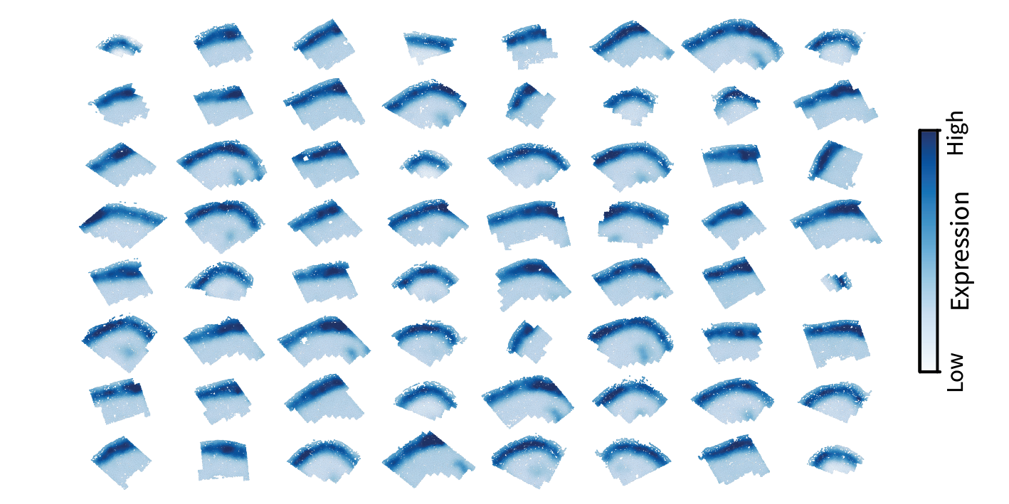
Now, with the intuition gained from our simulation, we will pivot to real data from the mouse brain. This dataset is composed of 64 samples from the mouse primary motor cortex (MOp), which displays the molecularly-defined layered structure that inspired our simulation. Each sample was collected using MERFISH and consists of 248 genes measured over ~5000 cells. We will start by visualizing the results from one sample before generalizing our analysis to multiple.
One sample
Just as in our simulation, we can create a spatial mesh over the tissue to create a domain represented by the Laplacian $\mathbf{L}$.
Once we have that domain, we can identify frequency patterns (length scales) over it by calculating the eigenbasis $\mathbf{V}$ of the Laplacian. Again, we see that these eigenvectors and values capture different length scales of variation over the tissue.
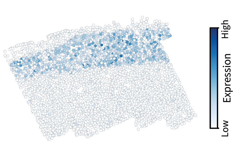
We can then project a given gene expression pattern $\mathbf{x}$ into frequency space by calculating $\mathbf{V}^{\top} \mathbf{x}$. Let’s do this with the gene Cux2, a neocortical layer marker analogous to the simulated gene we visualized above. The spectrum conveys the prominent large-scale pattern in terms of a low-frequency spike.

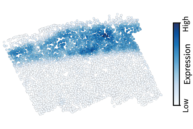
Given the diffusion kernel $f(\lambda) = e^{-\tau \lambda}$, we can perform low-pass filtering using the equation $f(\mathbf{L}) \mathbf{x}$. This smooths the original signal, in effect isolating the component of the signal that occurs on large length scales.
We could instead high-pass filter to isolate the small-scale components by calculating $g(\mathbf{L}) \mathbf{x}$ where $g(\lambda) = \lambda^{\frac{1}{2}}$. This emphasizes local variations in the signal by assigning them extreme values while washing away the rest of the signal toward middling values.

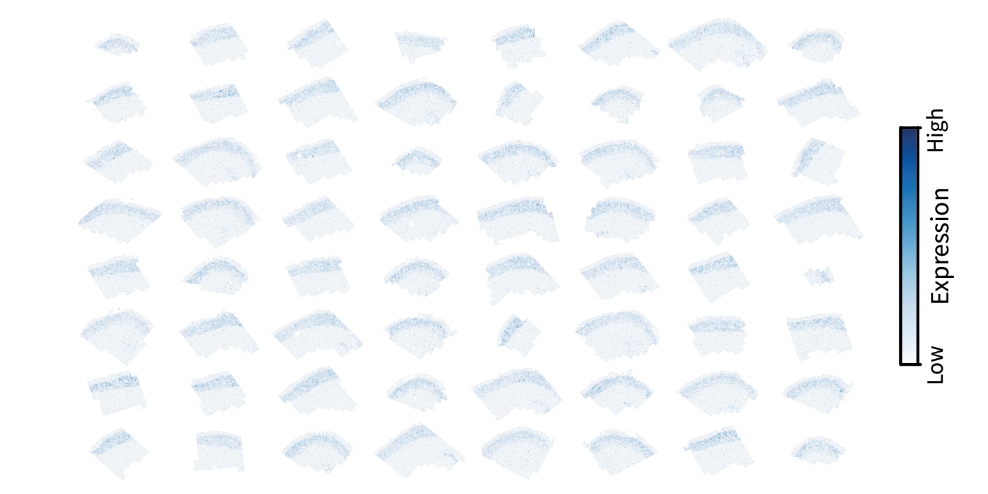
But there are 63 other samples in the full dataset. How might we analyze all of them together?
Multiple samples
A conceptual issue comes up when considering multiple samples. First, note that different slices entail different domains because they are made up of different sets of cells. Now consider two slices with domains given by Laplacians $\mathbf{L}^{(1)} \in \mathbb{R}^{n_1 \times n_1}$ and $\mathbf{L}^{(2)} \in \mathbb{R}^{n_2 \times n_2}$. These two slices likely have different numbers of cells, i.e. $n_1 \neq n_2$. Thus, the dimensions of these two matrices are likely not even the same. Given that a filter is a function of the Laplacian, one might wonder if filter kernels have consistent behavior across different tissues.
A key observation, however, is that filters are really functions of the eigenvalues of the Laplacian. So if the eigenvalues of different Laplacians are somehow comparable, then the filters should be as well. These eigenvalues are determined by the graph’s topology, i.e. structural features such as the distribution of node degrees. For two reasons, we argue that all tissue domains we construct have similar topologies and thus similar filter behavior.
- Edge-normalization of the Laplacian matrix yields eigenvalues in the range $[0,2]$, yielding consistent frequency ranges across different graphs.
- We assume that cells within a tissue generally resemble a uniform discrete sampling of continuous 2D space. In that case, given the consistent Delaunay triangulation approach, filtering behavior converges in the limit of sampling size.
Given these assumptions, we should be able to simply apply a given filter to each sample independently to yield comparable results.
Let’s take exactly that approach with low-pass filtering for illustration. We applied the same filter kernel to the Laplacian and gene signal for each sample:
\[\mathbf{\bar x^{(1)}}, ..., \mathbf{\bar x^{(64)}} = f(\mathbf{L}^{(1)}) \mathbf{x^{(1)}}, ..., f(\mathbf{L}^{(64)}) \mathbf{x^{(64)}}.\]The resulting smoothed patterns appear exactly as we saw for a single sample above, indicating that we can indeed expect comparable filtering results across different tissues.
Altogether, the same approach derived from our simulation enables us to characterize gene expression along specific length scales in real biological data. Note that this process is the same as conventional single-cell analysis across multiple datasets with the addition of a preliminary spatial filtering step.
Conclusion
We set out with the goal of describing gene expression signals on arbitrary length scales, which is the first step to identifying multicellular regions and intercellular interactions. We ended up showing that signal processing provides a rigorous framework for doing so. Now that we’ve developed this framework for individual gene signals, the next step is to generalize it to multiple genes at a time to characterize their relationships on a given length scale. It might be intuitive that this could help us represent multicellular regions, for instance. For instance, we should be able to low-pass filter gene expression patterns and then plug them into the standard single-cell workflow to identify large-scale clusters, i.e. regions. Indeed, this is the cornerstone of all region identification methods in the field, from those based on simple spatial smoothing to those based on complex graph neural networks.
In the following posts, we will leverage the tools we established here to establish a conceptually and quantitatively consistent framework for defining regions and interactions. In particular, we will find that positively covarying low-frequency patterns define regions while negatively covarying high-frequency patterns define interactions.