Spatial Omics II: Defining Multicellular Regions
A principled approach to representing multicellular regions in spatial omics data
Introduction
In this post, we’ll follow up on our previous work to identify regions in spatial data. By performing PCA on low-pass filtered gene expression signals, we can gain insight into the anatomical structure of a tissue.
However, this is the essence of so many other methods. So we should ask the question: why would we do all this work just to replicate what so many other methods already do? The answer is that it will build a bridge between existing conceptual and quantitative notions, providing a theoretical foundation for spatial omics. Upon this foundation, we will end up constructing additional representations of features such as interactions that other methods struggle with. Furthermore, these representations will reside entirely on the gene level and will enable fully unsupervised analysis, whereas existing methods rely on cell types (which obscure the rich gene level information) and/or databases of known interactions.
But that’s a lot of grand ideas that will come up later. For now, let’s just have fun thinking about this typical approach in a quantitatively rigorous way.
Simulation
Recall that low-pass filtering isolates large-scale patterns. Let’s visualize the result of low-pass filtering on a given gene expression signal over the tissue. Consider a marker gene for the outer region of the simulated tissue that we constructed previously. Drag the slider left to right to compare the signal before and after filtering.


Note that the small-scale variation in expression has been washed away. Neighboring cells are forced to look more similar to one another, in effect isolating only large-scale patterns. With these low-pass filtered signals, we can begin comparing them to find interesting gene-gene relationships that ultimately describe regions.
Simulated region components
Intuitively, a group of gene expression patterns that overlap in the tissue should represent a region. We can find these groups by looking at pairwise relationships between gene signals. Consider low-pass filtered gene signals $\mathbf{\bar x}_i, \mathbf{\bar x}_j \in \mathbb{R}^n$. Because these signals are vectors and we want a scalar measure of similarity. One way is to compare them by taking the inner product:
\[\mathbf{\bar x}_i^{\top} \mathbf{\bar x}_j \in \mathbb{R}.\]With some mean centering, this is defined as the covariance. While we will continue to refer to this as covariance, we will omit all mean centering for simplicity (although it will often add a “junk component” describing a translation, as described previously).
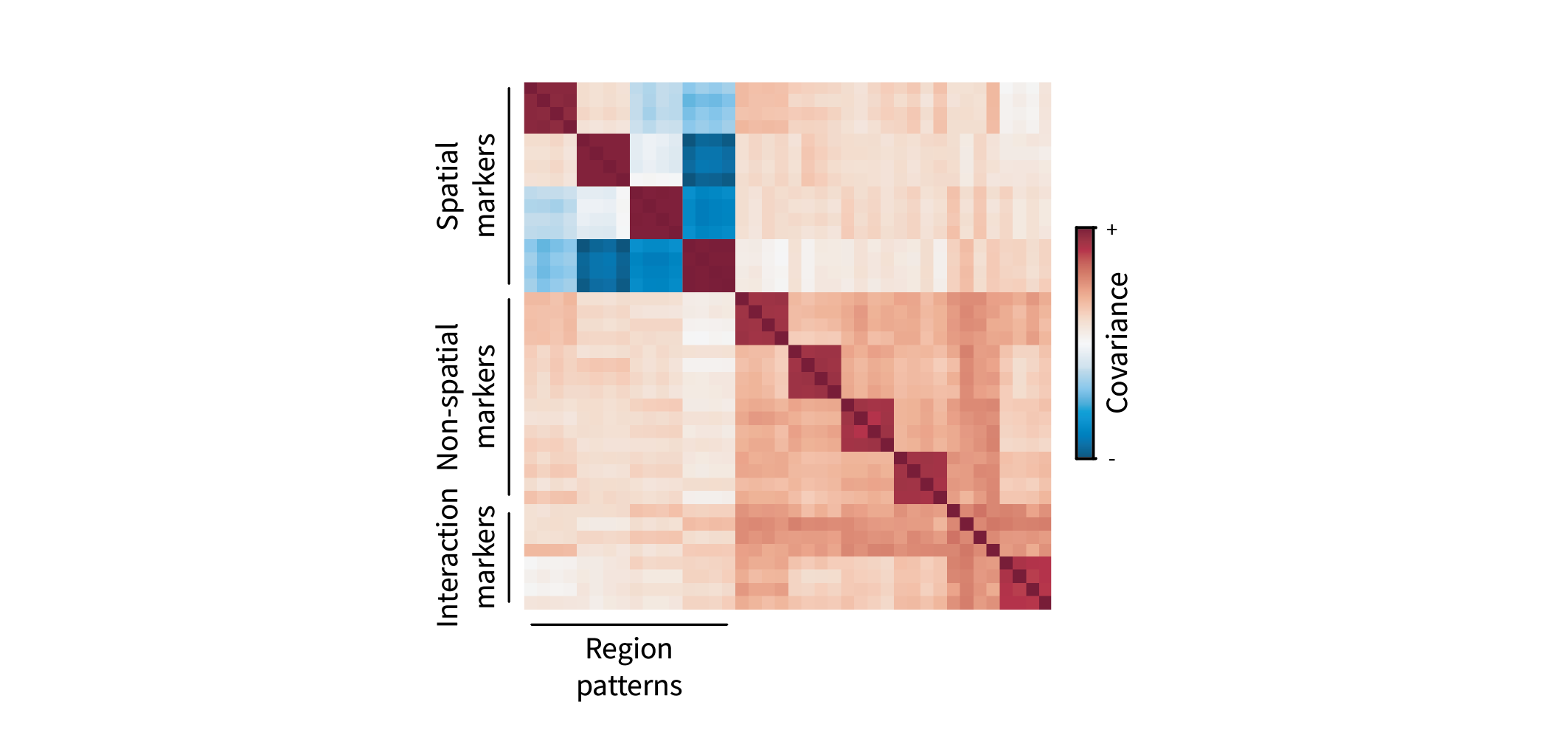
But we aren’t just interested in one pair of genes; we want to look at all pairwise relationships. Let $\mathbf{\bar X} = [\mathbf{\bar x}_1 | … | \mathbf{\bar x}_g] \in \mathbb{R}^{n \times g}$ represent the cell-by-gene matrix of low-pass filtered gene signals. Then the gene-by-gene covariance matrix is given by
\[\mathbf{C} = \mathbf{\bar X}^{\top} \mathbf{\bar X} \in \mathbb{R}^{g \times g},\]with entries $\mathbf{C}_{ij} = \mathbf{\bar x}_i^{\top} \mathbf{\bar x}_j$. We can visualize $\mathbf{C}$ as a heatmap. The genes are sorted based on their corresponding ground truth region patterns, so we expect to see interesting groups of covarying genes as blocks. (If you look closely, you’ll see that these blocks are 4x4, as there are four gene markers for each pattern.) For instance, gene markers for each region form red blocks along the diagonal. These denote positively covarying groups of genes, i.e. gene programs. Furthermore, different blocks appear to negatively covary, forming blue blocks along the off-diagonal. Conceptually, this just means that gene markers for each region are mutually exclusive.
Ultimately, we seek to distill these blocks into a simpler representation – perhaps by grouping genes within related blocks into a single “gene program” describing a region. It turns out we can do this by eigendecomposing $\mathbf{C}$, i.e. performing PCA. (For a primer on PCA, see this post.) Briefly, eigendecomposing the gene-gene covariance matrix yields the eigenbasis
\[\mathbf{U} = [ \mathbf{u}_1 | ... | \mathbf{u}_g ] \in \mathbb{R}^{g \times g},\]where $\mathbf{u}_i \in \mathbb{R}^g$ represents the gene loadings for PC$i$. In other words, it describes each gene’s participation in gene program $i$. We can visualize this matrix as a heatmap as well. The rows represent each gene in the same order as in Figure 2. The columns now represent PCs, or “region components”, and the colors describe how much and in what direction a given gene contributes to a given component.
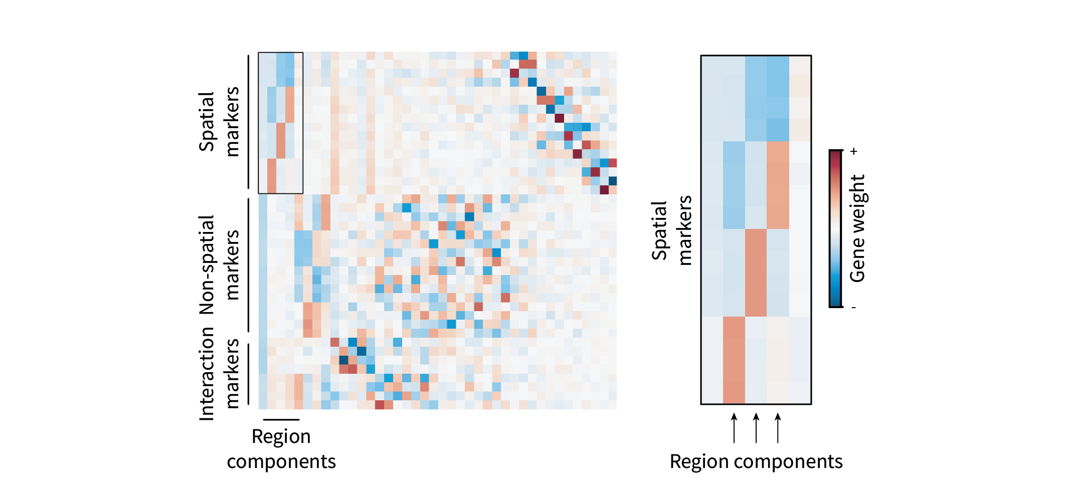
The first component is entirely negative and is likely just a consequence of neglecting mean centering (the “junk component” mentioned above). The second, third, and fourth components each appear to describe relationships between regions, with each representing a positive and negative region.
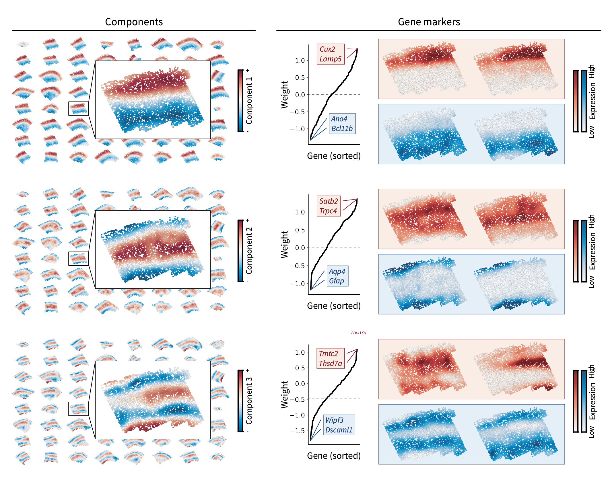
We can also visualize each component in the tissue by projecting cells onto each gene program, i.e. $\mathbf{X} \mathbf{U} \in \mathbb{R}^{n \times g}$. We end up seeing that they each describe two regions of the tissue. The first component describes the outer ring versus everything inside of it, the second component describes the second-most outer right versus everything inside, and the third component describes the third-most outer ring versus everything inside. We can also sort gene loadings to identify gene markers for each region component. This gives a set of top genes describing the “positive region” and a different set for the “negative region”. We can visualize each of these markers in the tissue as well, seeing that they are indeed expressed within the regions they describe.
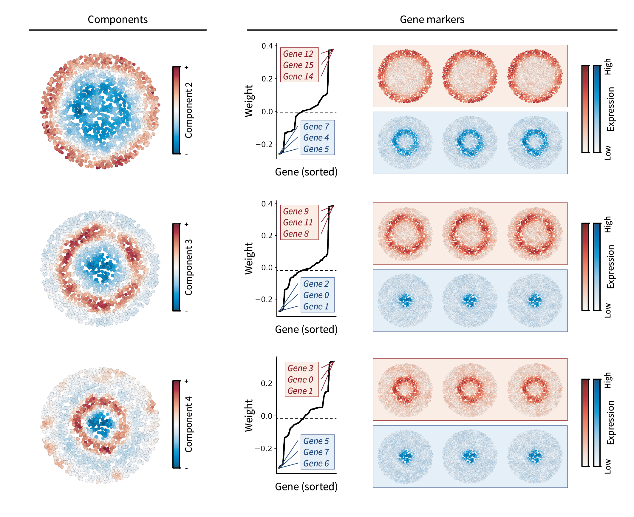
Altogether, we find that each component represents a large-scale pattern between regions. Note that the gene marker information shown in Figure 4 is the same as the information shown in Figure 3, just in a different form.
Simulated region gradients
The above components indeed appear to contain orthogonal information, as they each describe unique sets of regions. Together, however, these features might describe more complex region patterns. Rather than projecting cells onto a single component, one can instead project onto multiple components that form a multidimensional “region space”. In other words, rather than plotting cells in the tissue and coloring by the top three different region components as above, we can directly plot each cell in three-dimensional component space and see what shapes they form. Try interacting with the plot below to get a sense of the resulting shape.
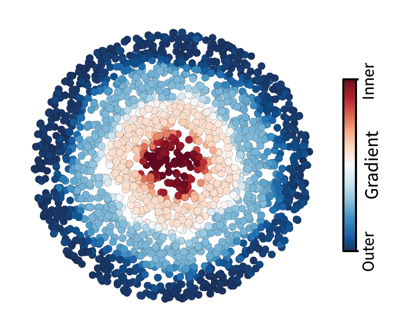
The cells appear to form a one-dimensional manifold. Along this latent line are kinks that form four vertices of a tetrahedron – but we’ll come back to this observation later. First, let’s fit a line to the manifold so that we can visualize it in tissue space. We’ll do this by treating the manifold as a domain and then finding the lowest frequency along it. We first connect neighboring cells in this region space using a weighted Delaunay triangulation. Cells closer to one another have higher weights while those further from one another have lower weights. This defines a domain in component space. We can then calculate and eigendecompose the corresponding Laplacian matrix to find the lowest eigenvector which represents the lowest frequency and thus the longest path through the domain. Note that this approach is essentially equivalent to diffusion maps, which is a common single-cell trajectory inference method. Again, try interacting with the plot below to confirm that we’ve fit a line along the manifold.
The resulting line forms a gradient from one tip of the manifold to the other. Now let’s visualize this gradient in the tissue. We can take this same coloring and simply apply it to cells arranged in the tissue domain. Indeed, we find a molecularly-defined gradient that stretches from the center of the tissue outward, matching the way our tissue was constructed.
However, while this is a really neat way to view region features in the data, one might ultimately wish to tie this information back to the ground truth region labels we started with. Moreover, we still have to figure out what those four vertices along the manifold correspond to.
Simulated region clusters
To assign each cell to a discrete region label, one can cluster cells in region component space. We can simply perform k-means on the top three components we’ve been visualizing so far. We’ll choose $k=4$ given the number of ground truth regions in our simulated dataset. After clustering, we can return to our cells in region component space and color them by our new discrete region labels.
It appears that the resulting clusters partition cells along the gradient. Once again, we can take this coloring and apply it to our cells in tissue space.

As expected, we end up with the ground truth region clusters. Furthermore, these four clusters appear to be defined by each of the four vertices along the manifold. Thus, vertices in low-pass latent space appear to describe discrete regions. The cells in between each of these vertices are presumably located near the boundares between regions, and they form a glue that connects the vertices to form the manifold.
Mouse brain
Now let’s see how well the above analysis generalizes to real tissues, using the mouse MOp as an example like in the last post. Since it’s the inspiration for our simulation, we can just repeat each of the above analyses to identify region components, gradients, and clusters.
Let’s start by visualizing our previous low-pass filtering results to build intuition. Using the slider, note how low-pass filtering isolates the large-scale components of the gene expression pattern. The gene visualized here is Cux2, which is a canonical neocortical layer marker.


After applying the same filter to all genes in the dataset, we can perform the eigendecomposition described above to obtain region components.
Brain region components
We find that the resulting components indeed show an interesting layered pattern that’s supported by their corresponding gene markers. However, there’s an interesting pattern that didn’t emerge in our simulated data. Notice how the region components themselves appear like a frequency basis along an axis from the upper to lower edges of the tissue. Earlier components represent larger-scale fluctuations, while later components represent smaller-scale fluctuations. These fluctuations occur along an implicit axis along the depth of the tissue, suggesting the presence of a molecular gradient. While this pattern won’t change our gradient identification approach going forward, I found it really beautiful and figured it was worth pointing out.
Brain region gradients
To calculate the molecular gradient, we’ll follow the same approach as earlier – namely treating the manifold as a domain and finding the lowest-frequency component along it. Unfortunately, the amount of data prohibits interactive 3D visualization. But we can still plot the cells in component space from multiple angles to get a sense of their latent shape. As in our simulation, it seems they form a one-dimensional manifold, and the resulting gradient coloring appears to describe the change along that manifold from end to end.
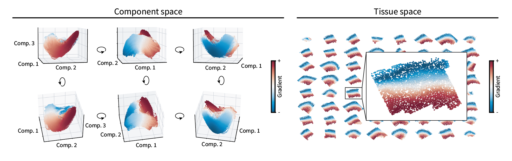
When plotted in the tissue, the gradient appears to run between the outer and inner layers of the neocortex. Thus, it appears our gradient identification approach applies to real biological data as well. However, to make the anatomical layout of this data clearer, we can assign discrete region labels and see if they reflect the known anatomy.
Brain region clusters
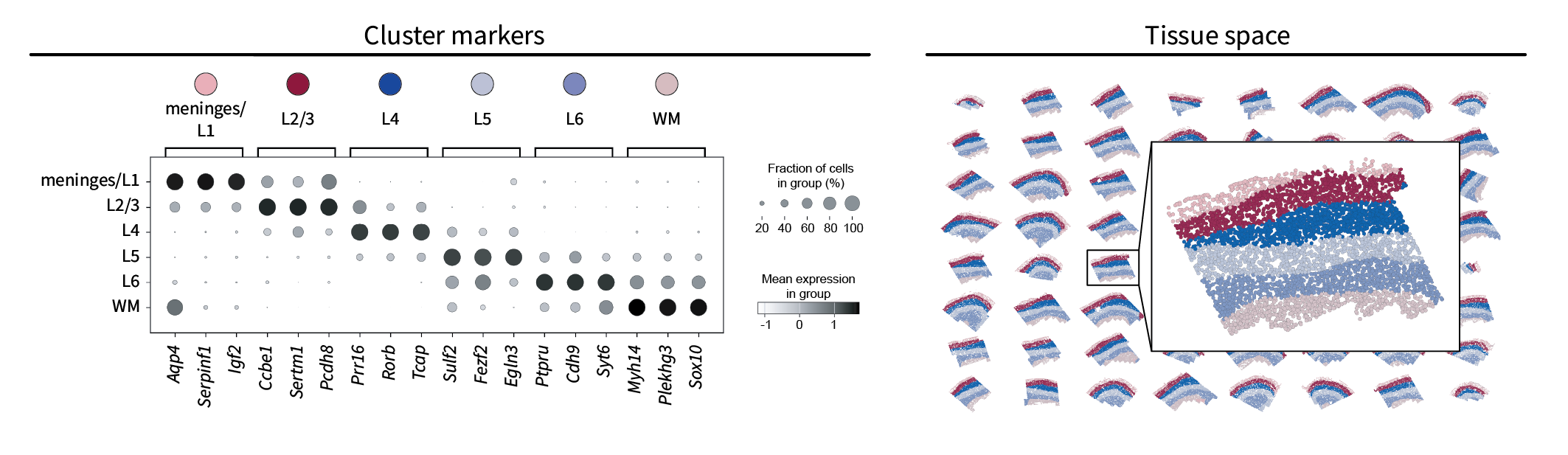
Just as in our simulation, we can apply k-means to the top three components visualized above to assign each cell a region label. Unlike in our simulation, however, we don’t know the ground truth number of regions that should inform our choice of $k$. Nevertheless, we can approximate it based on the known anatomy, in which four cortical layers named L2/3, L4, L5, and L6 are sandwiched between the meninges above and white matter (WM) below. Thus, we will set $k=6$, perform k-means, and expect to find a similar set of regions.
One way to compare our region clusters to the known anatomy is based on their gene markers. Using Scanpy’s standard one-vs-all t-test-based approach, we can identify the top three gene markers for each region and compare them to the known anatomy with references such as CELLxGENE. This results in a simple annotation of each region that matches the literature quite well. Additionally, note that the markers for one region appear to bleed into the next region. This is likely due to the low-pass nature of the data, in which the boundaries between regions are blurred. Finally, we can plot the resulting region labels in the tissue domain to find that they form layers characteristic of the neocortex, further validating our approach.
Human lymph node
The above analysis is by no means restricted to tissues with layered structures. It should, in principle, be applicable to any tissue with any arrangement of molecularly-distinct regions. To test that, we will use a new dataset that was collected from a different organ, from a different species, and using a different spatial transcriptomic technology. Our new dataset is a sample of the healthy human lymph node and consists of 377 genes measured across 377,957 cells measured using Xenium.
Let’s briefly introduce a bit of biological background. Broadly, the immune system is tasked with recognizing and eliminating potentially harmful cells or molecules in the body, e.g. bacteria or viruses. A special subset of cells are dedicated toward learning to recognize these “antigens”. They do so through an evolutionary process. Each B and T cell has a random, unique receptor shape that it can use to bind to (i.e. recognize) antigens. Dendritic cells then find antigens and show them to B and T cells to see which ones can recognize them. Only the cells that recognize a given antigen survive and go on to proliferate and fight the underlying infection. Lymph nodes serve as hubs for antigens, dendritic cells, B cells, and T cells all to aggregate and interact. Its anatomy is split into separate zones such as the cortex – where B cells are “educated” – and the paracortex – where T cells are educated. This is a crude overview, but it should provide enough context going forward in this series of posts.
We are interested in finding these anatomical regions using the above approach. The first step is performing low-pass filtering to isolate large-scale patterns. Here’s another interactive demonstration of filtering, this time in the human lymph node and showing a T cell marker gene called TRAC.


We can see that filtering emphasizes the large-scale structure over the tissue, such as the upside-down cup shape toward the center. As this is a T cell marker, we would anticipate that these patterns correspond to the paracortex. We’ll find that out by briefly identifying region components and clusters (and ignoring gradients since they aren’t as prominent as in the mouse brain).
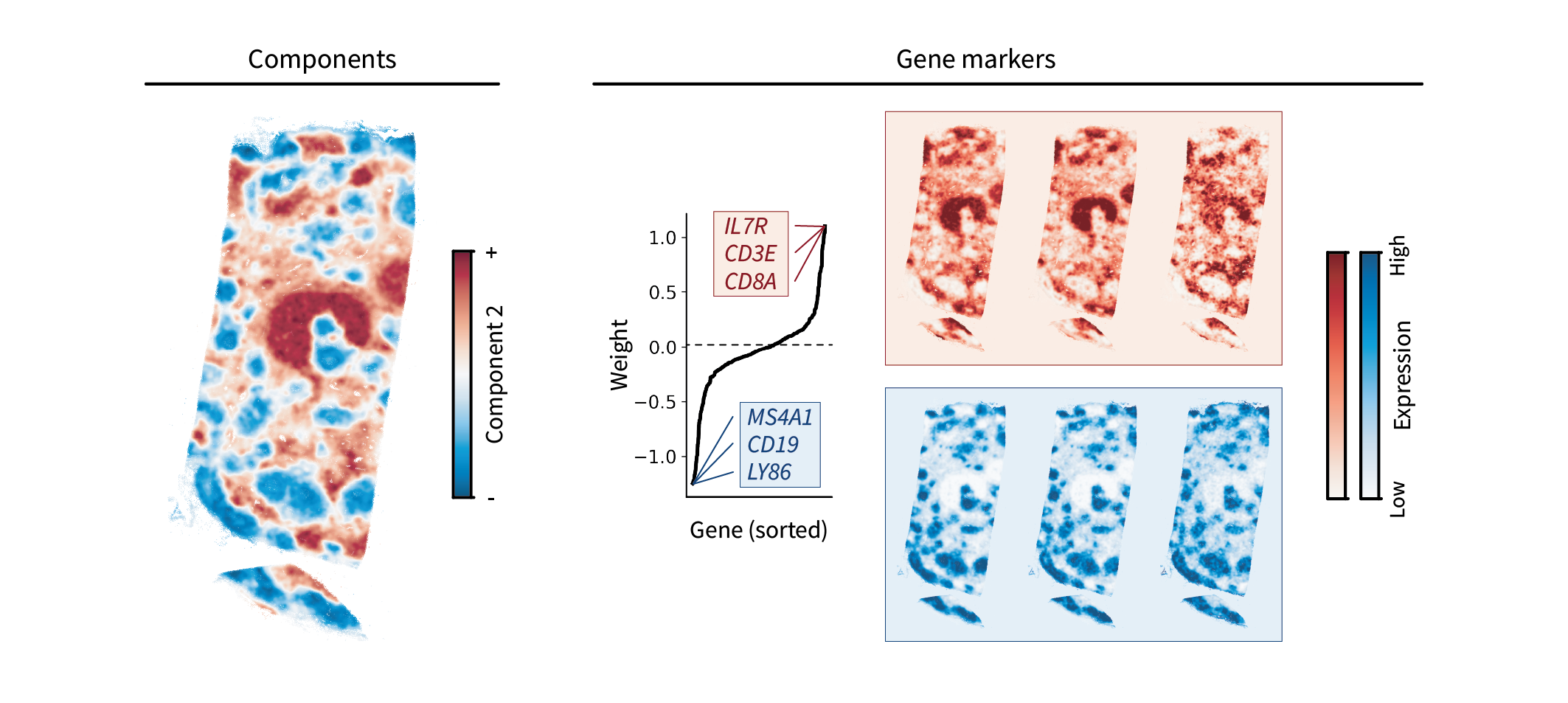
Lymph node region components
One component in particular stands out when performing the above analysis on our human lymph node dataset. Ignoring the first translation component, the top region component appears to capture the paracortex in red and another region in blue. This blue region is likely the cortex, which is characterized by B cell “follicles”. These guesses are validated by the top gene markers, which are canonical T and B cell markers and overlap with the observed areas.
While this component alone seems to capture much of the lymph node anatomy, we can perform clustering on the top three components to assign discrete region labels and get a clearer sense of the anatomy.
Lymph node region clusters
As above, we will perform clustering by applying k-means to our cells in component space. Canonical lymph node anatomy suggests that we should choose $k=3$ to reflect the cortex, paracortex, and medulla (which is basically just vasculature and connective tissue outside the other two regions). The resulting clusters yield distinct markers of each region, including T cell markers in the paracortex, B cell markers in the cortex, and markers of vasculature in the medulla. In the tissue, these regions appear to represent a discretized version of the above components.
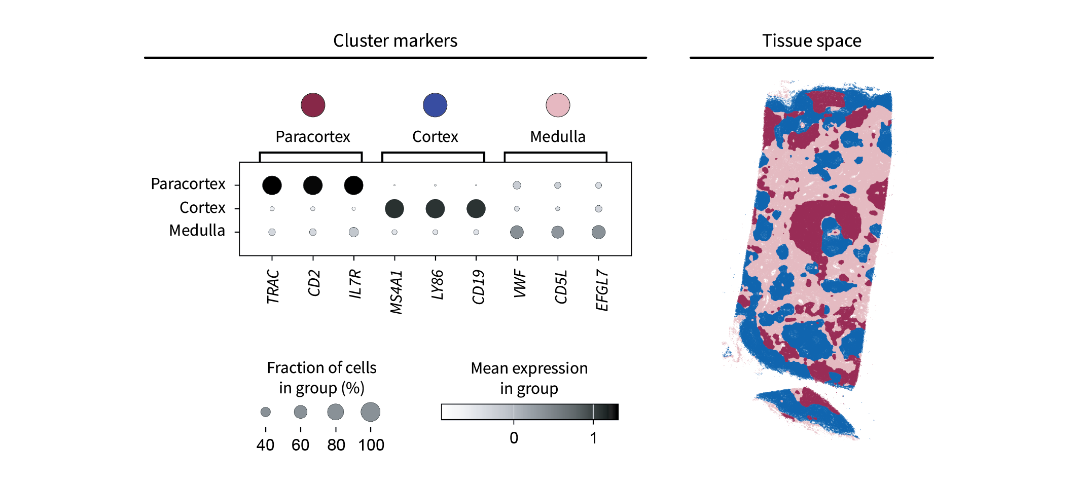
Altogether, it appears we’ve identified the proper lymph node anatomy.
Conclusion
We did it. We provided a mathematical framework for characterizing regions and even made some cool connections to PCA and diffusion maps along the way. But it’s at this point that I find myself asking the painful question: who even cares about regions? Without a wealth of disease-control or spatial perturbation data to compare, they’re just blobs of cells that aren’t explicitly tied to a mechanism. What we really care about are the interactions inside of them, since they represent the molecular forces that determine tissue structure and function. So we should instead be shouting the question: HOW CAN WE REPRESENT INTERACTIONS? Furthermore, after exploring low frequencies this whole time, one might be yelling: WHAT DO HIGH FREQUENCIES MEAN? In the next post, we’ll show that these two questions are deeply related.